Coles Copal Varnish
Cole's Copal Varnish is an amazingly usefull 'tool' . CCV greatly improves brushwork when added to either hand-ground oil-and-pigment paints or those commercially produced today. CCV also greatly speeds the drying of any oil paint without the means of metal oxide drierying agents. Some painters called this varnish "copal drier". CCV is.made according to the original 18th C. formula. This varnish belongs to a class of historical oil painting varnishes I term "Gelling Varnishes". Simply stated, gelling varnishes congeal oil paints. This congealing effect is actually stronger than that produced by adding meguilp to artist's oil paints. This mechanic of congealing oil paint allows certain desirable and historically-valued oil painting effects not attainable in any other way.
When Cole's Copal Varnish is used with handground oil paints and mixed/applied within the following guide-line system, the resulting paint exactly matches the effects observed today in the work of English landscape painter, John Constable ( and many other 19th Century oil painting masters). This is not surprising as Constable was cited by George Field ("Chromotography") to have used this type of copal varnish. This varnish also re-creates the paint-character observed within Thomas Cole's work, as well as other painters classed among America's Hudson River School of landscape painters.Cole considered this particular varnish as the finest copal varnish for painting. In a letter written in 1859 to his fellow painter, Asher Durand, Jasper Cropsey stated the varnish prized by Cole was constructed from the resin of an Agathis pine tree known as the Damera Copal, AKA "dammar copal" and also "Borneo kauri"). [The golden resin produced by this Agathis pine tree is not to be confused with the white dammar resin exuding from the Dipterocarpaceae-type (typically the Hopea and Shoria) deciduous trees of Borneo and India.] In New York City the actual copal varnish was made by a man named Fectwanger. [Fectwanger wasn't the first to supply this varnish as it was historically available to English artists at least as far back as the mid-1700's.] This copal varnish, sought and lauded by oil painters, seems to have become unavailable by the 1860's, resulting in painters like Frederic Church (who was schooled by Cole in the use of the varnish) having to add wax and metallic-based driers to their paint.
[For those interested, they can find that 1859 letter from Cropsey to Durand here: https://www.aaa.si.edu/collections/items/detail/jasper-francis-cropsey-london-england-letter-to-asher-brown-durand-6905 ]
According to a much earlier letter Cole, himself, wrote to a younger Durand, Cole referred to this copal varnish as "copal drier"; and he supplied some direction for its use. The paints were given a few drops of "copal drier" on the palette then mixed well with the knife. The addition stiffened (congealed) the oily paint, whereupon a few drops of turpentine spirits were given to achieve a desired brushing consistency. The treated paint recorded the bristle-work beautifully and permanently. As the solvent evaporated, additional solvent was added. The paint beame fluid and yet retained the precise track of the brush. Fresh paint could be applied easily atop previous layers due to the solvent evaporating away, which stiffened and 'set' the underlying paint. Cole also used this varnish to varnish his completed works. Cole added a few drops of oil to a small amount of this copal varnish then thinned it slightly with solvent for application, whereupon it dried quickly. His paintings lasted beautifully and look amazingly fresh to our modern day eyes. [Some conservators claim copal varnish has no place in permanent oil painting. I have never found any basis for this belief, except in the case where artists utilized linseed-rich copal varnish. Those oil-heavy varnishes were never mean't to be used in oil paint. They were constructed to withstand the outdoors; and they did yellow horribly. However, by stark contrast, Cole's great paintings as well as the many others who used this varnish show off color-brilliance and paint-permanence unlike anything other.]
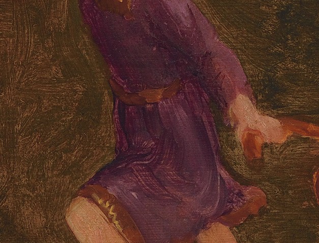
Below image: Cole's sketch for the youth in his "Voyage of Life" series. This sketch of the figure's tunic, as well as the background, shows the typical capture or "keeping" of the brush-striations using what would normally be an oil-rich "runny" transparent or translucent paint-- a characteristic also found in so many second generation HRS painters. The addition of wax is another means to producing this congealed paint-effect; however, wax weakens the solubility of oil paint.
Directions for use
This copal varnish is mixed directly with the paints on the palette. Do not thin this varnish nor tamper with it in any way. Our regular 19th C. Copal Varnishes can be mixed with the paint or they are easily incorporated with oils and solvents to create painting mediums. By comparison, Cole’s Copal is not “medium friendly”. It does not combine well with oils or solvents unless the oil, solvent, and varnish are heated to the same general near-boiling temperature , then combined together slowly and with much stirring. Such combination is a time-consuming and tricky operation which often results in the varnish becoming cloudy and the copal eventually precipitating out of suspension. Thus, the primary method for using this particular varnish was then-- and still is-- to simply add it directly to the colors upon the palette just prior to use. The varnish and paints are mixed together using the knife and the resulting paint is congealed and behaves as if it were combined with a jelly medium. Again, this paint-congealing trait allows certain desirable effects not attainable using regular oil or non-gelled mediums.
As guiding example of the typical performance of this copal varnish I’ll supply the following images and description:
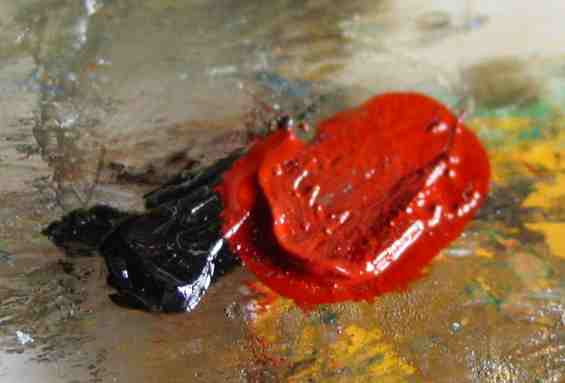
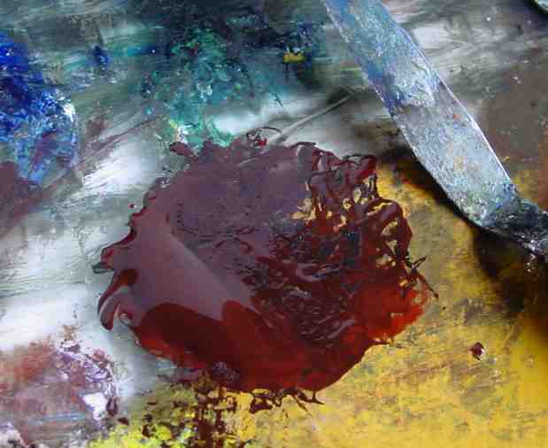
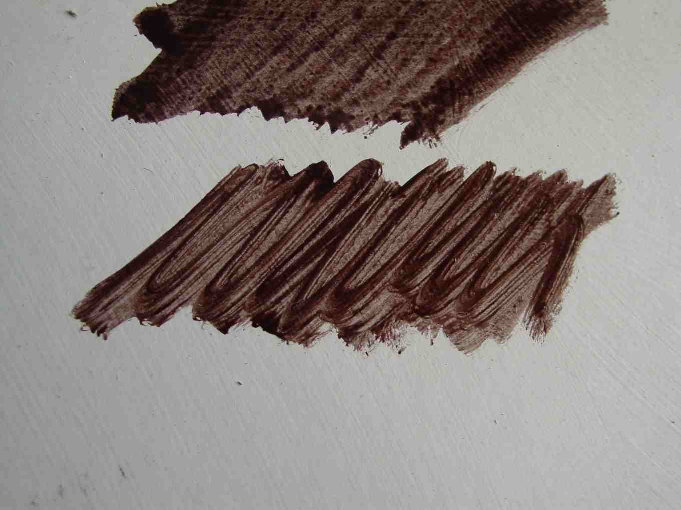
This first close-up image shows the creation of a monochrome brown quite suitable to either landscape or portrait or figure painting. A tiny bit of Lampblack and iron oxide red – both exceptionally powerful ‘colors’– are dabbed onto the palette. [Note: The supplied image seems to show a lot of paint here but remember it's a close-up.]
Mixed together, the red and black creates the monochrome ‘brown’ color. This is my personal favorite brown for painting. This is the brown my eyes see in nature. Other painters prefer using an actual brown pigment-paint such as burnt umber.
If the brush is used to apply this mixed brown to the white ground, an opaque blackish-brown is the result. This paint is not yet conducive for use as a monochrome.
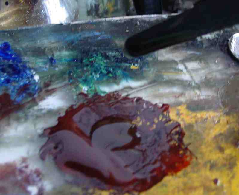
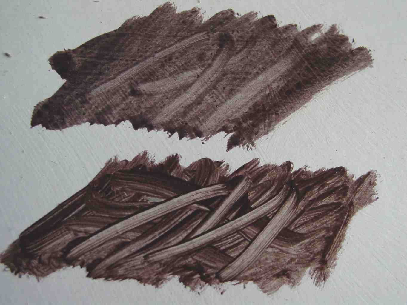
Now, if six or seven drops of oil are added to the mixed brown, a creamy slurry is attained which can be scrubbed out upon the white ground.
This thinned-down paint applied to the white ground displays the transparent nature of the brown, which is what we desire for a proper monochrome; however, this juicy brown will not hold the stroke. Instead, the superfluous oil diffuses and forms halos around dust or other bits in the ground. Holding the stroke is a necessity to achieving the sought manner and method of the olden painters. Attaining this quality is where the proper varnish comes into play.
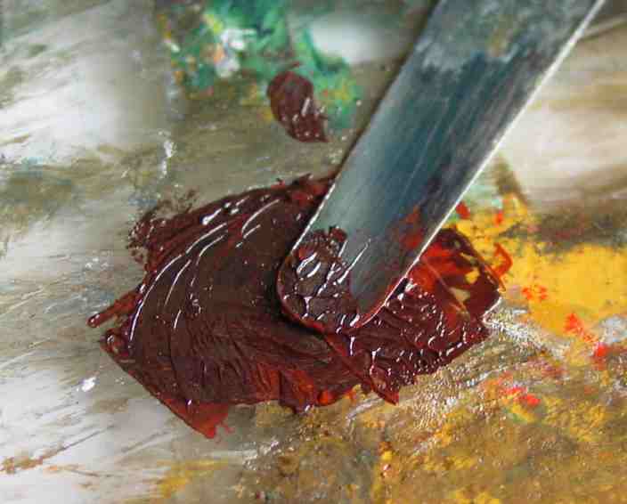
I'll now add the same amount of drops of Cole's Copal to the slurry of mixed brown on the palette.
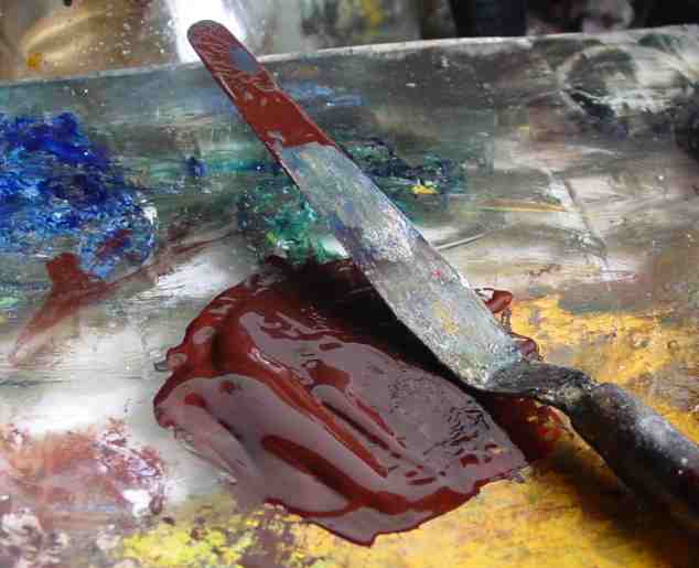
I re-mix the whole mass with the knife and the paint becomes softly congealed -- just enough to obtain the needed character. My brown now stands up a bit more than before. If I were using most any other type of varnish, my brown paint would simply puddle and diffuse with the increased liquidity.
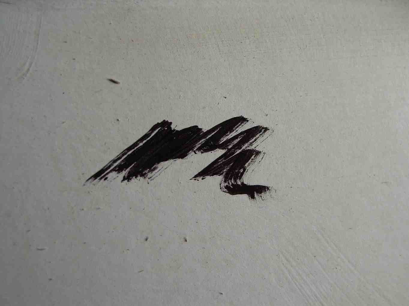
Observe how the brown monochrome color will now hold the brush-stroke as it is applied. There is no diffusion and, as shown in the next image, I can push, pull, swab, and re-arange the applied monochrome to my every whim. By visual comparison, the untreated brown cannot hold any manipulations; any re-working simply diffuses away. Also notice how the varnish-treated brown seems richer, more intense/ saturated in color. This is the optical effect of suspending pigments in a 'glassy' varnish-containing binder; and applying a final varnish to the upper sample to regenerate gloss will NOT produce the same effect (the sample shown is already glossy). Again, this richer, almost 'burning' effect is due to a suspension of the pigments*. The copal-treated oil-y brown is now rendered perfect for building and manipulating any design upon my white ground. [*note: according to Vasari, the varnish of van Eyck, when added to his colors, caused those colors to appear as if "lit up" from within. This effect is available via the use of a paint-congealing varnish.]
As with the brown, the Cole’s Copal is also added to all colors on the palette. I generally mix equal amounts of varnish to my small paint dabs; though excepting the lead white, which would become too transparent using such equal amounts-- though that condition can come in handy for certain effects, too.
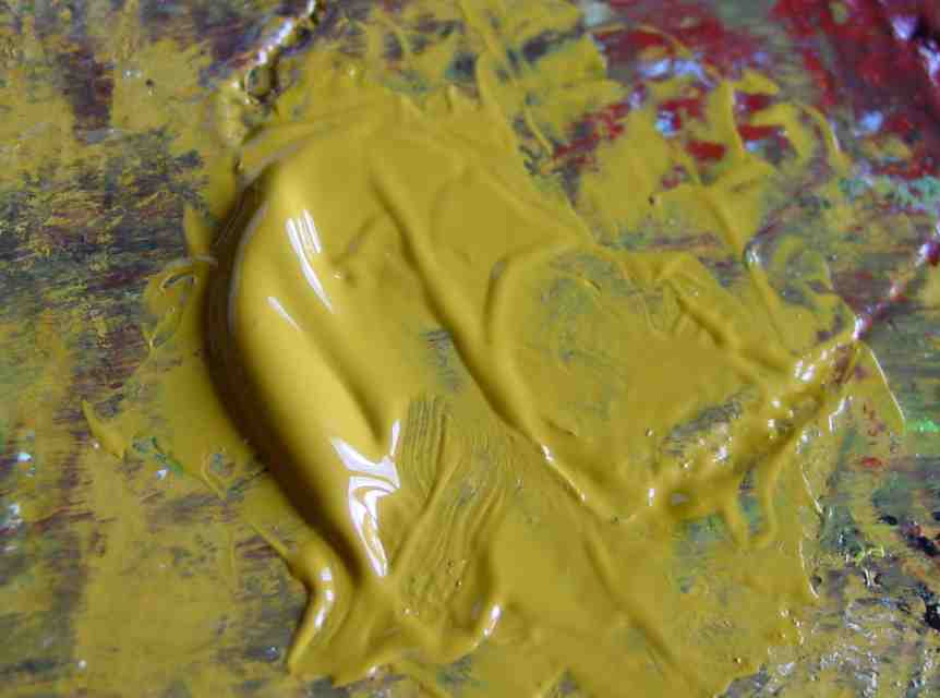
The paint shown in the image below is a nut of yellow ochre which has been compounded with an equal amount of the varnish. It appears soft and creamy but it will remain where it is placed and show the physical nature of my brush-man-ship– which is something awarded the painter through much experience at this time-honored craft.
What follows is the effect obtained when the creamy congealed yellow ochre is applied into and beyond the wet monochrome brown.
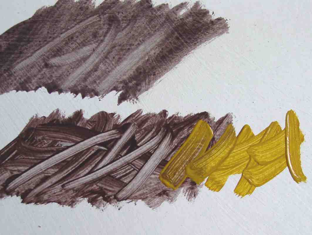
Some might wonder how simply adding a pure varnish could allow all the myriad COLOR-effects required for, say, even the simplest landscape painting. Well, as you can see above, the applied yellow ochre is translucent and visually exhibits a variety of tones. Where it is thinnest against the white ground, it appears as a light golden yellow; and where thickest, a pure somber yellow ochre tone. This ability to supply different tones due to simple thick-thin paint-application allows much 3-D modeling with only one mixed color-- a powerful tool. Thus, there is no need to mix an exhausting variety of tints on the palette. One only needs a few mixed colors coupled with the correct brushmanship, and the various shades are optically-generated via the underlying white ground.
Of course, for certain APPLICATION effects, such as one encounteres when desiring to portray tree branches or architectural details, something in addition to the varnish is required. That something is a solvent. I usually choose turps. You see, once the paint has received a strong dose of the copal varnish, a solvent can be mixed with the paint into an ink-like format and with no fear of running or spreading when suitably applied.
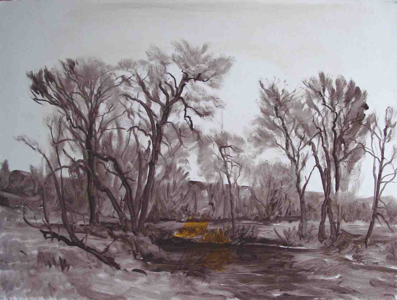
To demonstrate a monochrome and its use within the painted work I'll use my conjured brown to scrub-in a design on a prepared paperboard (ignore that dried spot of YO in the middle ground area ;-}. I leave the sky bare as I do not wish my brown to "infect" whatever colors will be placed therein. As for the ground area, this brown goes well with any applied colorings that become inter-mixed with it. Fact is, it won't much tinge the sky areas, either-- it's just a very friendly brown.. Again, it is a very forgiving brown for a landscape/portrait/ figure-piece. BTW, this paperboard is coated with a dried non-absorbent white lead ground and it measures 11x15 inches.
I could now leave my monochrome to dry for a day or two; then apply coloring atop it, allowing it to guide my hand and even lend detail by having it show through my predominantly transparent/translucent over-paints ...or I can begin coloring into it now, while wet, effectively producing a multichrome; or even a finished work, here-and-now, all-at-once.
I'll just go ahead and colorize my monochrome now. Of course, over-painting atop a wet monochrome will necessitate a bit of destruction to my carefully-constructed mono ....but it can be rebuilt along the way.
My simply palette is YO, Ult, Prusian blue, an iron oxide-red, cad yellow medium, lead white and lamp black; also, I still have brown from my monochrome left over. My colors are creamy and if I need further thinning to help with application, I lightly dip my brush into solvent then use that wet brush to re-mix my color-piles into the desired consistency.
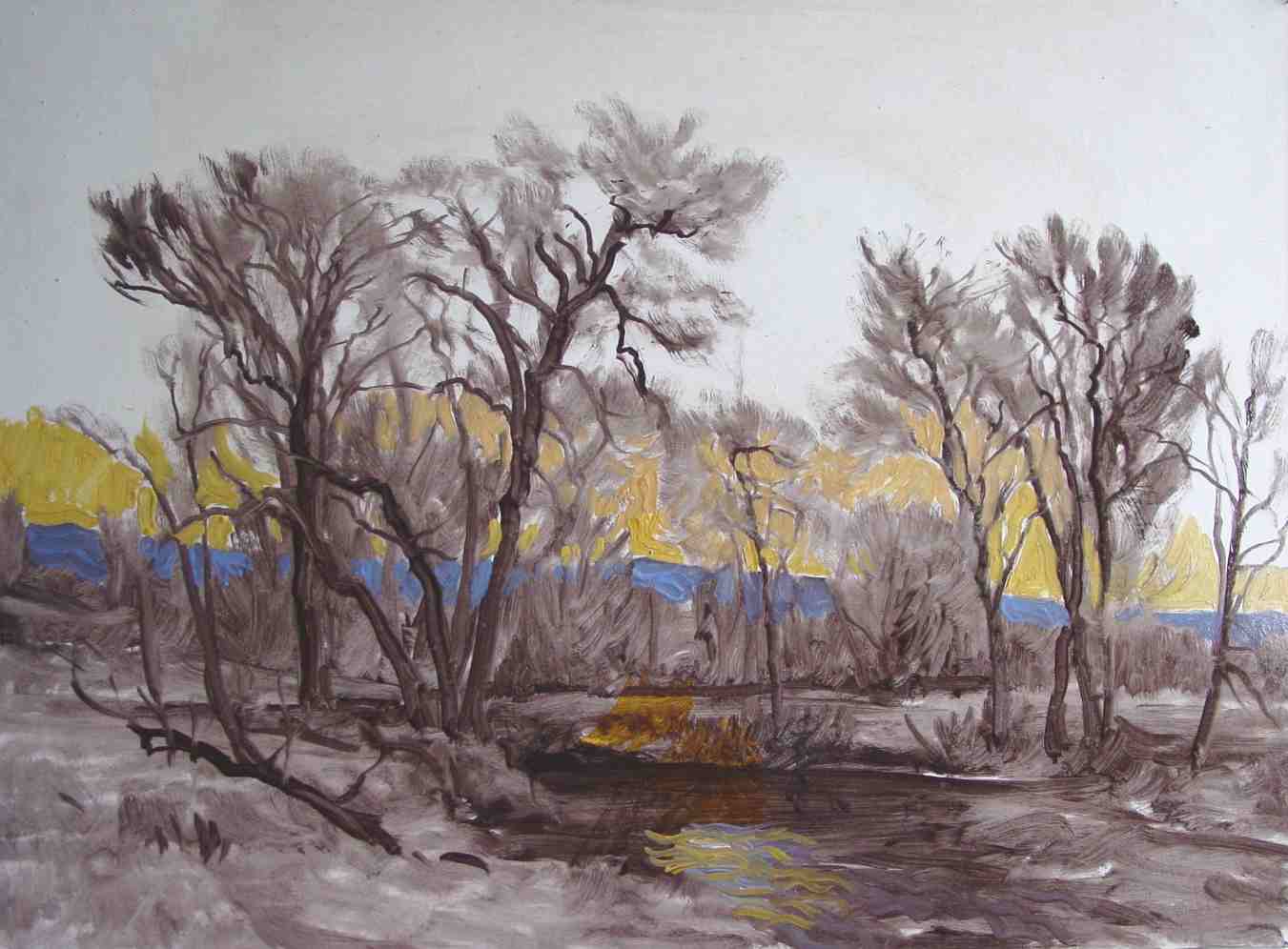
I start with the horizon by brushing in a golden sub-tone made of YO and white. My sub-tone salmon pink in the sky is a mix of YO and iron red coupled with lead white. The paint is soft and creamy and goes easily onto the ground. The brushwork is luscious; and if it is too stiff for the application at hand, a bit of turps worked into the pile will provoke remedy.
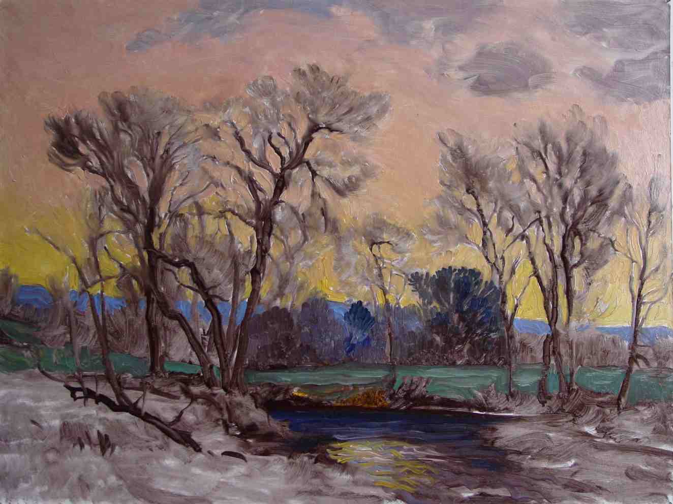
Above I blend the completed sky with a soft brush. Yes, my monochrome trees become softened but there is yet plenty suggestion remaining to guide the mind and hand later when I put in the details such as leaves and branches.
Greening my Springtime trees. My thin tree branches are placed using a longer-haired synthetic Taklon rigger dipped frequently into turps then stroked well into the paint-pile. The proper stropping/stroking keeps the brush hairs in perfect formation.
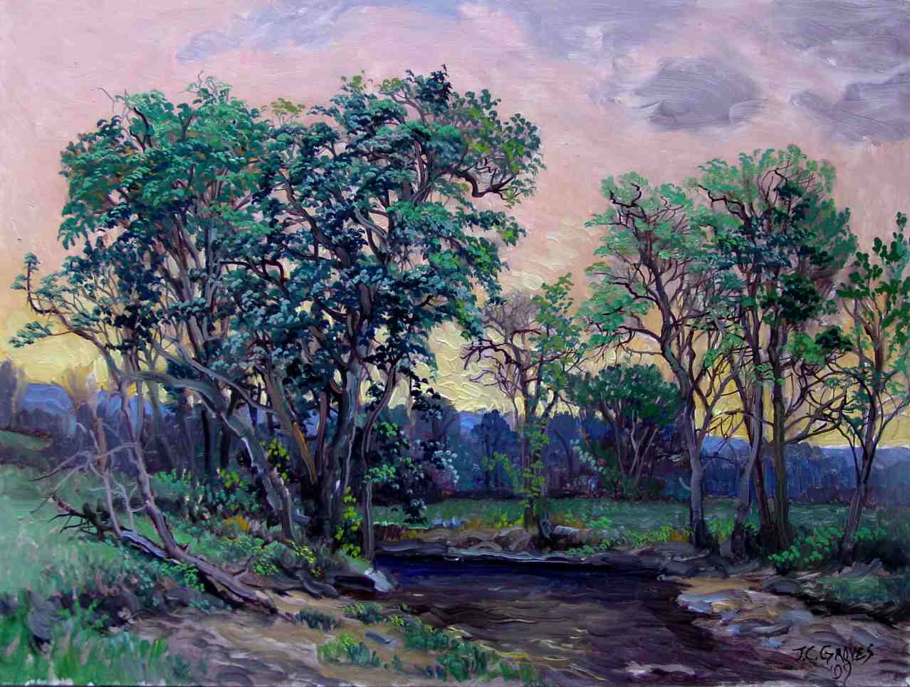
I add illuminating brightness to the sky by applying a mixture of some cad yellow and white. The more somber yellow-ochre and salmon pink sky-ground allow the bright yellow to glow.
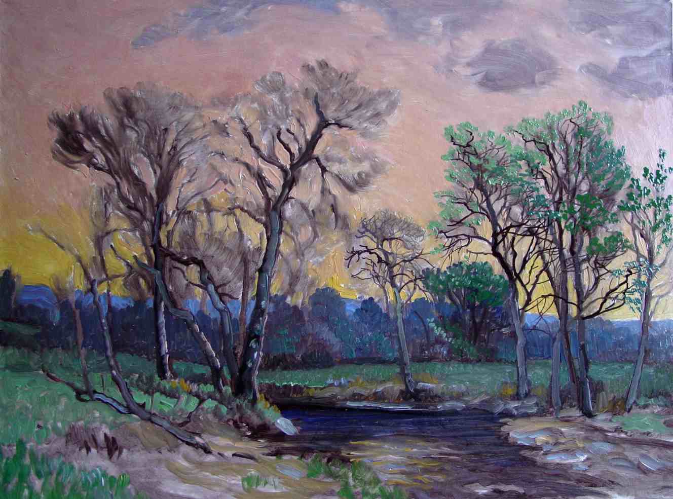
I add more tree-foliage and grass-- the leaves and sprigs are applied as little blobs of paint. This adds charm to a painting. I adjust things all around, such as simply stroking back through the water area, tidying it up. Finally, the above image shows the finished work photographed under an even natural light:
James C. Groves Frostburg, Maryland; April, ‘09
For Ordering Online click here
Click here to visit our Gallery page.